The Ogilvy Standard for Advertising and What It Actually Looks Like
David Ogilvy did not leave behind a “style.” He left behind a standard and method for achieving the standard. But on second glance, he did leave behind have a style in his book ‘Ogilvy on Advertising.’ It was an important piece of learning for a young public relations manager who took a job that included print advertising, though he did not know the first thing about producing ads for print in business-to-business trade journals. (it was me).
I followed Ogilvy’s style for ads, brochures, mailers and posters for over 30 years. Each of these help sell and many won awards. But mostly, they sold. And that was Ogilvy’s point; the only thing an ad should do is sell. Not be a vehicle for personal, artistic expression but sell more than possible without an ad.
Too often, people reduce his work to long copy, serif fonts, or mid-century print layouts. That misses the point entirely. The Ogilvy standard was not visual nostalgia. It was a system built around one governing principle: Advertising exists to sell.
Everything else was secondary. If you strip away the style guide elements, what remains is a rigorous framework for copywriting, layout, and design that is shockingly relevant today. If there were a 21st century guide for producing promotional materials, my hope was that it would still be David Ogilvy. Here are the elements that remain relevant.
- The Copy Standard: Sell With Specificity
Ogilvy believed the headline did 80 percent of the work of selling. Not because headlines were decorative — but because they determined whether the body copy would be read at all. He studied readership data obsessively. He knew most people scanned. So he made the headline carry a benefit. Not clever. Not cryptic. Not self-congratulatory. A promise of benefits to the prospect about to turn customer. Contemporary ad studies show that if anything in an ad gets read, it is the headline. Same is true of press releases.
Ogilvy’s copy adhered to several principles:
- Lead with the benefit.
- Be specific, not vague.
- Explain how the product works.
- Offer proof.
- Avoid hype.
- Respect the reader’s intelligence.
He favored long copy when the product warranted it. His view was simple: if you are asking someone to spend money, give them enough information to justify the decision. Or put a bit differently, if the prospect is interested enough to keep reading, write something interesting. Do not pre-judge your prospect as one who has the attention span of a goldfish, give them some credit. Show your customers enough respect to believe they are inquisitive and curious. This flies in the face of most modern marketing.
Modern marketers often assume short copy equals higher conversion. Ogilvy assumed clarity equaled higher conversion. There is a difference. Clarity and persuasive copy that promises benefits will equal higher conversions.
- The Layout Standard: Structure Over Decoration
Ogilvy did not design ads to win awards. He designed them to be read, understood and acted upon. His layouts followed patterns rooted in research that he did, his interest in what would possibly make a difference was the motivator. Ogilvy’s insights based on his own research led to the following list of directions. The ad should guide the eye naturally from headline to explanation to conclusion. Here is how to do that.
- Strong headline at the top. For anyone who notices an ad the only part most will even bother to read is the headline. So make the headline explicit. Name the company/product and how it will make the readers’ life better.
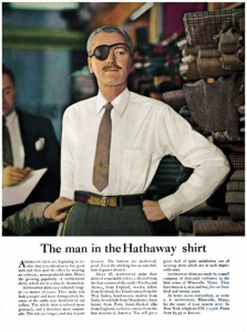
- Image that supported the claim (not distracted from it). Often show the product or the results.
- Body copy arranged for easy reading. Specifically,
- Times-Roman Serif type in 12-point size. Ogilvy found that sans-serif type was more difficult for the eye to adhere to and that the spaces from the serifs allowed the western eye to adhere to the letters and words more easily.
- He also found that sentences that were an alphabet and a half in length were easiest to read. Think of how copy from a magazine looks. Like that.
- He also advocated the ‘drop cap.’ That really big capital letter at the start of chapters or books in the Bible. Ogilvy found that the drop cap drew the eye and caused it to move down the page more easily.
- Reversed copy (white letters on a black background) was practically invisible according to Ogilvy.
- Subheads to maintain momentum. Subheads break up the copy and make it easier to read.
- A clear call to action. Or as Ogilvy said, the ‘invitation to join the church.’ In many traditional church services, people who are interested in joining are invited to do so as the service ends. The same should be true of advertising with an offer of more information, free tutorial, cost free consultation or something else of value at the end.
- Claiming the offer self qualifies a serious prospect from the ‘tire kickers’ and is an important step in the selling journey.
- Very few people will make the jump from awareness to purchase the first time they see information about a product or service. This is especially true of expensive items like freight cars or quarries.
Ogilvy avoided clutter but also shunned emptiness. White space was functional, not aesthetic. Every element in an Ogilvy ad had a job.
Ogilvy was skeptical of layouts that inverted hierarchy — giant abstract visuals with tiny, buried copy. He understood something many modern brands forget: if the message is hard to find, the sale is hard to make. Do not make ads hard to read. People have no patience for anything that causes them extra work.
For David Ogilvy, design served comprehension for readers and made understanding why they needed what the advertiser was offering clear.

- The Design Standard: The Product Is the Hero
Ogilvy’s philosophy rejected ego in design. He famously warned against “artdirectoritis” — work driven by the tastes of creatives rather than the needs of buyers. He had no patience for campaigns designed primarily to impress award juries. So many of these award-winning ads sold little and left their agencies out of work, but clutching their award.
In David Ogilvy’s ads the product was always the protagonist.
Design elements existed to reinforce credibility, not to overshadow it. Photography was chosen to support the claim. Captions were written because he knew they were heavily read. Logos were placed strategically for memory retention.
He understood something fundamental: Consumers are not buying your design.
They are buying what your product does for them. If your layout distracts from that, it is not clever. It is just expensive.
- The Psychological Standard: Respect the Buyer
Underlying all of it was a deep respect for the audience. Ogilvy did not treat consumers as fools. He did not shout. He did not rely on empty superlatives or any other form of trickery. He presented information as if speaking to an intelligent adult capable of making a rational decision. This is what separated his work from mere copywriting. He built trust. And trust compounds if maintained.
- The Measurement Standard: Evidence Over Opinion
Perhaps most importantly, Ogilvy demanded proof. He tested headlines. He measured response rates. He studied coupon returns and readership surveys. Ogilvy understood that creative opinion is cheap. Data is decisive and persuasive. “Test your ads on a continuous basis and your ads will always improve.’ This amount of rational thought is not often considered in any type of marketing because buying decisions are thought to be mostly emotional. That makes sense as personal taste, likes and dislikes are based in large part on emotions. But Ogilvy’s reliance on data, benefits and other rational criteria challenge the purely emotional appeal.
The Ogilvy standard requires discipline not just in writing and layout, but in evaluation. If the ad does not produce results, it is not good advertising — regardless of how modern or beautiful it looks. While David Ogilvy did not coin this phrase, he would have approved; “In God we trust, everyone else brings data.”
Why the Standard Still Matters
Today’s advertising environment is faster, louder, and more fragmented. But human psychology has not evolved nearly as quickly as media channels. Everything for sale is not best marketed via Tik Tok influencers, nothing against them, but we are not all females in our twenties.
People still respond to:
- Clear benefits
- Specific claims
- Logical explanations
- Credible proof
- Direct language
The Ogilvy standard is not about reviving long copy for its own sake. It is about aligning creativity with persuasion. Long copy is of no value if it does not contain information about customer benefits.
In an era obsessed with aesthetic trends and algorithmic hacks, and short attention spans his methods seem groundbreaking. The way an ad looks means less when the question is not whether an ad looks contemporary. But does it sell. No ad is creative if it does not compel sales. That is the only question Ogilvy would still ask: Did it sell?
To discuss advertising, marketing communications and/or public relations please contact Harold Nicoll at (443) 987-0195 (cell), info@media-public-relations.com and https://media-public-relations.com.